//Thoughts
Digital Artist Review
Visual Case Study
Works of a digital artists are truly amazing. The amount of time, craft and attention to detail can be nothing short of astonishing.
Donald Phan, a digital artist and college buddy, has impressed and inspired me with each new piece of work posted on his website. However, the presentation of this website lacks the professional craftsmanship of his paintings and 3d renderings. In this case study, I will review his site and provide a solution for the issues that arise.
Lets take a closer look
Looking at the overall site, it does not appear to have enough contextual content to warrant a five page site. In actuality a few pages could essentially be combined such as “Contacts, Resume, and Links.” The portfolio page is straight forward, but does not easily allow Donald’s work to be scanned quickly. When the page initially loads, only six pieces of work are within view. It is not until the scroll bar is engaged to reveal 38 additional pieces. While this is not necessarily a bad thing, the portfolio section is the center piece of this website. It should be easily scannable or filtered and shouldn’t be hidden.
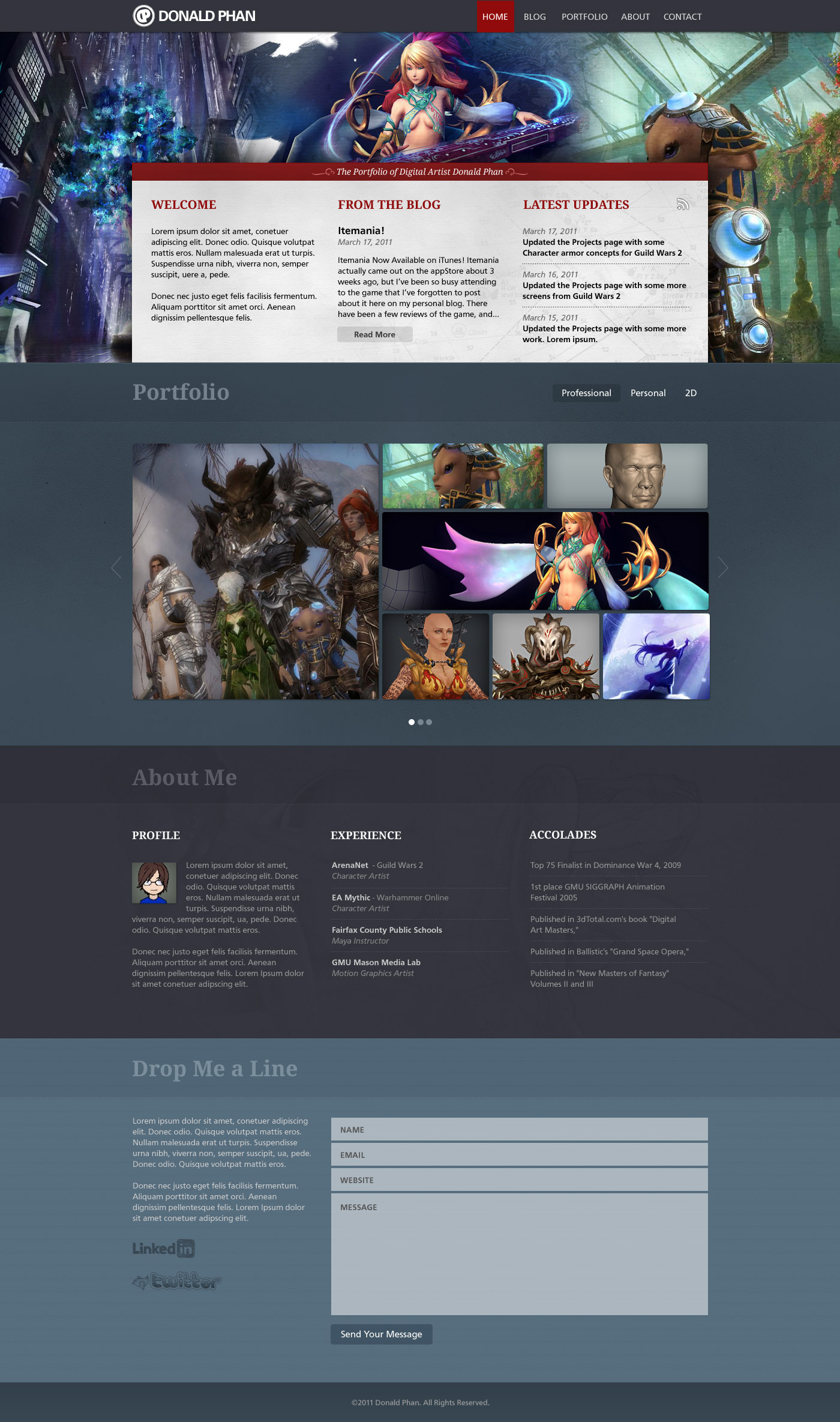
A possible Solution
For my proposed redesign, this website, with it’s minimal content high imagery focus, would be a perfect candidate for a one page scroller. The overall theme was about reflecting the sophisticated and painterly nature of Donald’s work. This included using subtle paper textures that one might find on a canvas or in a sketchbook, and using tones that are slightly washed. The header section features a huge and colorful collage of Donald’s work which further aids in establishing the tone and mood of the site.
A rich red was used as an accent color to direct the focus of the layout, drawing the eye from the navigation to the introduction area. This area operates much like the homepage of Donald’s current site and allows users to quickly view updates. Stepping down the page, the portfolio section is revealed. His work is split into two categories which are professional and personal work and can be filtered using the tab navigation on the right. The portfolio section displays twelve thumbnails at a time and operates much like a typical popup modal.
The about section is more or less his current resume page. It contains a brief profile, previous work experiences, and accolades. Bringing up the rear, we approach the contact area, which contains a contact form as well as any social network links.
In general, I believe this solution provides a polished and professional design that compliments the quality of Donald’s work. As always, these case studies are merely a personal exercise and these designs should not be considered a final solution.